COVID 19 and Elderly Care: Japan registered low mortality despite highest ratio of 65+ population
A comparative analysis of the ratio of the elderly population and deaths per million people in 63 countries shows that institutionalized elderly care and sanitation practices were highly effective in saving the lives of senior citizens from COVID 19. Japan with 28 percent of its population aged above 65 years registered 88 cases and 2 deaths per million people in comparison to Italy which has 23 percent elderly population but witnessed 2,997 cases and 399 deaths per million population.
 Mala Ramanathan, Udaya S Mishra and Bevin Vijayan
| Updated: 07-05-2020 16:51 IST | Created: 07-05-2020 15:34 IST
Mala Ramanathan, Udaya S Mishra and Bevin Vijayan
| Updated: 07-05-2020 16:51 IST | Created: 07-05-2020 15:34 IST

The COVID-19 virus has spread its tentacles across the globe with a mounting number of cases and deaths over time. In less than a couple of months, COVID-19 went from being a disease that affected one province in China about which we had barely heard to being declared a global pandemic by the World Health Organization on March 11, 2020. As we watched the spread across countries, complacency gave way to alacrity and country-wide monitoring of cases began with varied reasons being offered for higher rates in one country and lower rates in the other. Statistical and epidemiological jargon such as exponential growth, flattening the curve, death rates etc., have become common vocabulary whether or not we understood what they exactly mean. Several non-verified theories abounded as the pandemic cast it's global footprint wider by the day.
Since Northern Italy experienced a higher death rate compared to Wuhan province in China, speculations are rife regarding possible causes behind it. However, previous studies show that every epidemic or pandemic has its own course and the consequent death rates are difficult to approximate during the outbreak of the disease. For this reason, during outbreaks, conventionally, an approximation of the rate of deaths in the population is given by the Case Fatality Rate (CFR). The real or final CFR of an epidemic or pandemic is computed at the end of the disease outbreak through a simple formula - total deaths due to the pandemic in the numerator and the total number of known cases in the denominator. For convenience, this value is multiplied by 100 or 1000 to enable comparison across time and place. However, the computation of CFR during the epidemic involves the risk of overestimating the CFR because of two reasons - lack of completeness in reporting of cases that understates the denominator and higher number of deaths at the peak of the epidemic which overstates the numerator. Hence, a realistic CFR could be obtained for the entire period of the pandemic with more accurate data on the number of cases and deaths due to the disease throughout the whole period of the pandemic.
Regardless of these caveats, the tendency has been to compare the death rate in Italy against those of China and Russia. Various explanations are being put forth to explain the relatively higher death rate in Italy due to the COVID 19 pandemic. They include a delayed response by the State to poor adherence to social distancing requirements among Italians. Alternative explanations were also offered to explain the increase in death rates in European countries such as respect for democratic norms and the inability to impose restrictions on mobility. There have been three major propositions regarding the association of the elderly population with a high fatality rate due to COVID 19 infection.
- Probability of death is higher among the elderly as evidenced by the Chinese experience where the death rate amongst the 80+ was as high as 14.8 percent and about 8 percent in the 70-79 years age group.
- Speculations also suggest that the higher rate of smocking among elderly in Italy was the main reason behind the high fatality rate due to the COVID 19 infection. However, the current age-standardised adult smoking tobacco use in China was reported to be 24.9 percent (among those aged 15 and above) and it was 23.5 percent for Italy. These shreds of evidence from the Global Tobacco Survey also suggest that tobacco use rates do not vary too much across Italy and China.
- The death rates were also associated with co-morbidities such as NCDs and risk factors for NCDs which are also related to age.
Age-related morbidity and mortality is a natural process that is expected to intensify through the life cycle with an enhanced experience of morbidity and disability. Nonetheless, our interest here is to explore the age effect on the COVID-19 experience across countries. This is a speculative exercise but warranted because of the reported age-related variations in mortality due to COVID-19 in several countries, in general, and China in particular. There are some studies that have examined the age effect on mortality due to COVID-19 and pointed towards a higher intensity of mortality in countries with older populations. They are based on the age dependency ratio and mortality per million population due to COVID-19 infection. These studies indicate that there is indeed an association between the number of cases and dependency ratios (proportion of the population aged above 65 in comparison to 15-64 years age group) and also between the number of deaths and dependency ratio.
COVID 19 Data Analysis
The present study seeks to thoroughly examine the proposition of high mortality rate among the elderly due to COVID 19 infection. There is an urgent need for closer scrutiny of correlation, if any, between a high proportion of elderly (65+) and mortality per million population due to the ensuing pandemic.
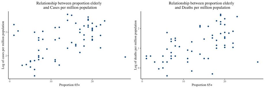
We attempted this by selecting 63 countries whose elderly population share ranges from about 1 percent to as high as 28 percent (that of Japan) and mapped the cases and deaths per million population against the proportion of elderly (aged 65+) in each country. As can be seen in Figure 1, all the countries seem to be falling along a line starting at the left lower end and moving up to the right upper end. This means that up to a reasonable extent, the changes in the cases and deaths uniformly correspond to the changes in the proportion of elderly across countries. Given the cluster of dots across Figure 1, it is difficult to discern if it is the only a uniform line across the countries or whether there are different lines waiting to be seen when we observe the same by regrouping the countries according to the proportion of elderly.
Figure 1: Relationship between the proportion of elderly, reported cases and deaths due to COVID-19 in 63 countries, April 21, 2020
To examine these in terms of the intrinsic variations or inherent differences in the proportion of elderly, we categorized them into three groups on the basis of the proportion of elderly in the population - below 10 percent, between 10-20 percent and above 20 percent. We examined the spread of the disease and its intensity using the twin features of an epidemic - spread in terms of the number of cases per million population and death rate in terms of the number of deaths per million population. As the scale of these two rates would make any visual representation of the proportion of 65+ population in a country and its cases against deaths per million population quite difficult to depict, we considered the logarithm of the rates. Taking the logarithm in this context helps to compress the width of the scale of each of these rates and brings them down to equally comparable levels for comparison against the proportion of elderly in each country. In addition, we have also converted the COVID 19 cases and deaths to compare mortality rates against the population size of each country by using the rate of cases and deaths per million population and presenting it on a scatter plot in Figures 2 and 3. The scatter plot shows how one variable is related to another through dots on the X-Y axis, where each dot represents a country. The collection of points depicts the potential association between the two variables.
Figure 2: Relationship between the proportion of elderly and reported cases due to COVID-19 by groups in 63 countries, April 21 2020
 Figure3: Relationship between the proportion of elderly and reported deaths due to COVID-19 by groups in 63 countries, April 21, 2020
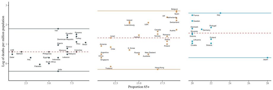
To derive a better understanding from the scatter, we selected the lowest and highest values against the Y-axis that represent the number of cases and put a bold line against the point on the Y-axis where it crosses the 50 percent of the points. This essentially represents a sort of middle most country in a listing of the cases per million population. When one observes across the three categories of countries, 1, 2 and 3, it is apparent that the minimum value moves from 1.15 for Group 1 countries to 1.60 for Group 2 countries to 1.94 for Group 3 countries. This confirms the intensity of the response of a number of cases in relation to the proportion of the elderly within a country. Similarly, at the upper end (i.e. the maximum value) is not so discernable across Group 2 and 3, but one can see the clear distinction between Group 1 and 2, where the highest values are 3.31 and 3.75. The same pattern repeats for the deaths per million population across countries, with a clear distinction in the minimum value across the three groups of countries ranging from -0.40 for Group 1 to -0.30 for Group 2 to 0.30 for Group 3.
What Figures 2 and 3 show is merely a split pattern of what is observed in Figure 1 where all the points were merged into one figure. Figure 2 divulges the kind of shift in the number of cases per million population within the country when it is read across the countries grouped according to the proportions of elderly (less than 10 percent to 10-20 percent and above 20 percent). While we can assume some modicum of linearity for each of these three groups, the y-intercepts (that is the point where the imaginary straight line across all the points on the X-Y plane hits the Y-axis) are different, indicating that they belong to three statistical groups otherwise termed as different populations.
Considering the association between the proportion of the elderly and the log of deaths per million population in Figure 3, a similar pattern emerges. If we imagine a line across a majority of the points in the three groups, in the first and second segments it would hit the Y-axis below '0', in the third segment, it would hit it between '0' and '1'. If we had only considered all countries together as we did in Figure 1, this distinction across the three subgroups would have been entirely masked.
Conclusion
This form of analysis where we examine the prevalence and death rates across countries against the proportions of the elderly does not tell us much about individuals within the country or their proneness to COVID-19. The frame of reference is ecological – meaning we have information about groups (here-countries) and not individuals within it. However, this is important evidence about the characteristics of a population – and the extent of a specific vulnerability within it – that is the proportion of the elderly population. Higher the proportion of the elderly, greater is the vulnerability. While this may not sound like a new finding in itself, it has evidence value as regards the response of varying levels of the elderly share of population and vulnerability to COVID 19. Careful calibration of countries by the cases and deaths against the proportion of elderly at any random point of time in the epidemic indicates that the cases and deaths systematically respond to the proportions of elderly within countries.
Verification
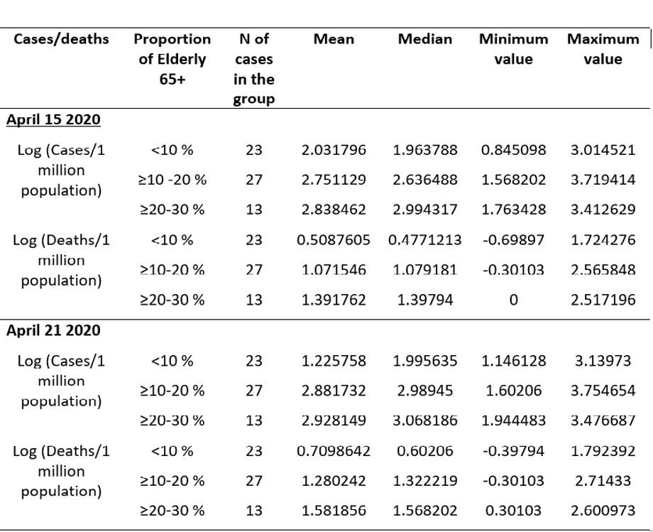
One might argue that this pattern is something that happened by mere chance. So, we verified it with the reported cases and deaths per million population for data on April 15, 2020, and find that except for a shift in the origin, the pattern remains the same. This agreement in the pattern between two sets of temporal information qualifies for consistency. There is merely a shift in the y-intercept across the two points in time. It means that with an upward shift in the level of the elderly, the number of cases per million or deaths per million population starts moving upwards. This can be seen as an increase in the values across all categories of countries as can be seen by the minimum, maximum and median (that is the mid-value of all the 63 countries arranged from lowest to highest) values across the two points in time for each of the three categories in Table 1.
Table 1: Log of cases and death per 1 million population with mean, median and range, April 15 and April 21, 2020, by proportion elderly in the population
There could be multiple set of reasons behind the observed variations in the number of cases and number of deaths within the populations of countries. The various efforts at social distancing, the health system response in terms of testing and treating infected citizens, the efforts at countrywide lockdowns could play a role in the variations in cases and deaths across economies. But at the macro level, there is a systematic response of vulnerable population structure (in terms of share of elderly) to the COVID-19 pandemic that is evidenced here with the help of inter-country data set at two points in time.
Recommendations
While public policy prescriptions for the post-COVID-19 scenario are indicative of learning to live with the pandemic, there will have to be special efforts made towards minimizing the risk to the vulnerable population. We do have lessons from the stories emanating from Japan and Italy. As on April 21, 2020, on the worldometer tabulation, Japan with 28 percent of its population aged above 65 years had 88 cases and 2 deaths per million population. However, Italy which has 23 percent elderly registered 2,997 cases and 399 deaths per million population. Thus Japan performed far better in protecting senior citizens.
We should look into the differential living arrangements of the elderly across countries for possible guidance. According to the UN report on Living arrangements for the elderly, Japan had about 51.3 percent of 60+ people living alone or with spouse and 18.4 percent were living in elderly care institutions. The corresponding figures for Italy are 69.5 percent living alone or with spouse and a small percentage of 1.4 percent living in elderly care institutions. However, 27.4 percent of the elderly live with their children in Italy, but the equivalent figures for Japan are not available in the same report.
In many countries across the globe, varying proportions of the elderly live with their offspring's and in Asian countries, in particular, this is a social norm. In such countries, extra care is needed in the post lockdown period to ensure the protection of the elderly. The norms for sanitation and hygiene being implemented to fight the COVID 19 pandemic at home as well as outside may be the new normal for tomorrow. We may have to envisage arrangements for protecting the vulnerable elderly living in homes with their children by evolving mechanisms for sanitizing those who step out for work as they return home. If not anything else, the positive collateral of this pandemic may highlight the significance of personal hygiene at home and civic behaviour in public space to a great extent.
NOTE: Mala Ramanathan is faculty and Bevin Vijayan is a doctoral student at AMCHSS, SCTIMST, Trivandrum Kerala India. Udaya S. Mishra is faculty at Centre for Development Studies, Trivandrum Kerala India.
(Disclaimer: The opinions expressed are the personal views of the author. The facts and opinions appearing in the article do not reflect the views of Devdiscourse and Devdiscourse does not claim any responsibility for the same.)
- FIRST PUBLISHED IN:
- Devdiscourse


